

⚡ Quick Answer: Mobile-First Indexing
Mobile-first indexing is Google’s policy of using the mobile version of a website as the primary basis for crawling, indexing, and ranking, rather than the desktop version. Google completed the global rollout in October 2023. It remains relevant because mobile-first indexing determines the version of your pages Google primarily uses for Search, including newer experiences such as AI Overviews and AI Mode — Google introduced dedicated Search Console reporting for those AI features in June 2026. A good starting point is comparing your site’s mobile and desktop content directly in Google Search Console.
What Is Mobile-First Indexing?
Mobile-first indexing means Google primarily crawls and indexes the mobile version of a webpage, using Googlebot Smartphone as its main crawler for this purpose. Google primarily uses the mobile version that Googlebot Smartphone can crawl and render when indexing and evaluating a page — for any visitor, regardless of whether they search from a phone or a desktop computer.
This is a policy about which version of a page Google looks at, not a separate ranking algorithm or a penalty system. Google’s own documentation states that it predominantly uses the mobile version of a site’s content, crawled with the smartphone agent, for indexing and ranking.
One Index, Not Two — How Google Actually Organizes This
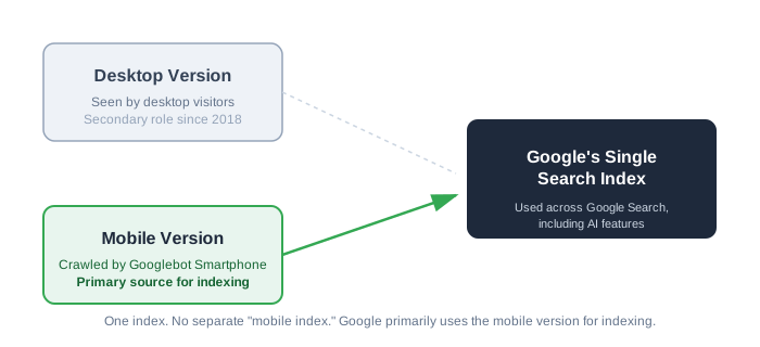
A common misconception is that Google maintains a separate “mobile index” alongside a “desktop index.” It doesn’t. There’s one index, and mobile-first indexing determines which version of your content feeds into it.
Because Google primarily builds that index from the mobile version, content that exists only on the desktop version may not be available to Google’s indexing systems in the same way. The mobile rendering is what Google works with, for visitors on any device.
What This Looks Like in Practice
Say a desktop product page includes a 1,000-word description, full specifications, and customer reviews. If the specifications and reviews on mobile only become available after a user interaction — a tap, a swipe — that Googlebot doesn’t perform, that content may not be available during Google’s rendering process. Google’s own guidance is direct on this point: it won’t load content that requires user interactions like swiping, clicking, or typing. Multiply that gap across a full product catalog, and you’ve got one of the more common sources of real-world mobile-first indexing problems.
Mobile-First Indexing vs. Related Terms
These four terms are often used interchangeably, though each describes something different and is controlled by a different party.
| Term | What It Actually Is | Who Controls It | Quick Example |
|---|---|---|---|
| Mobile-first indexing | Google’s policy of using your mobile version as the primary source for indexing and ranking | Google evaluates your mobile product page, not your desktop one, when deciding where you rank | |
| Mobile-first design | A design philosophy — build the small-screen experience first, then expand for larger screens | You / your design team | Designing a checkout flow for a phone before adapting it for desktop |
| Responsive design | A technical setup where one codebase adapts its layout via CSS to any screen size | You / your developer | The same URL and HTML serve both mobile and desktop; only the layout shifts |
| Mobile SEO | The broader practice of optimizing visibility and performance for mobile search and mobile users | You / your SEO team | Improving mobile page speed, tap-target sizing, and mobile usability overall |
Mobile-First Indexing vs. Mobile-First Design
Mobile-first indexing is something Google does to your site. Mobile-first design is something you do when building it. It’s possible to follow mobile-first design principles and still run into mobile-first indexing problems — for example, if a phone-optimized layout ends up hiding content that Googlebot never sees.
Mobile-First Indexing vs. Responsive Design
Responsive design is generally the simplest configuration for supporting mobile-first indexing, since the same URL and content structure serve every screen size. It’s one of three configuration options Google documents for mobile sites, alongside dynamic serving and separate URLs — covered in more detail later in this guide.
Mobile-First Indexing vs. Mobile SEO
Mobile SEO is the broader discipline. Mobile-first indexing is one policy within it. Page speed, tap targets, intrusive interstitials, and mobile usability all sit under mobile SEO, while mobile-first indexing specifically governs which version of your content Google looks at in the first place.
How Mobile-First Indexing Actually Works
Googlebot Smartphone vs. Googlebot Desktop
Google uses two main crawler identities: Googlebot Smartphone and Googlebot Desktop. With mobile-first indexing, Googlebot Smartphone is the crawler used for indexing purposes, while Googlebot Desktop can still crawl pages for other, secondary purposes.
What Googlebot Crawls, Renders, and Evaluates
Content needs to be more than technically present in the HTML — Googlebot also has to be able to render it. If a mobile layout blocks the CSS or JavaScript required to display certain content, Googlebot can end up capturing an incomplete version of the page, even if the underlying code technically contains everything.
Content, Link, and Structured Data Parity — Why It Matters
A common source of mobile-first indexing problems is a mismatch between the mobile and desktop versions of a page. Google’s own best-practice guidance is specific about what should carry over: the same structured data, the same robots meta tags, and titles and meta descriptions that are equivalent across both versions of the site. In short:
- Core content (not a trimmed-down summary)
- Internal links (so link equity flows the same way)
- Structured data (JSON-LD, schema markup)
- Titles and meta descriptions
None of this needs to be pixel-for-pixel identical in layout — but for these specific elements, “equivalent” means genuinely conveying the same information, not a looser approximation.
The Mobile-First Indexing Timeline: From Announcement to Today
Key Milestones (2015–2024)
| Date | Milestone |
|---|---|
| April 2015 | Google’s “Mobilegeddon” update makes mobile-friendliness a ranking factor for the first time |
| November 2016 | Google announces it’s experimenting with mobile-first indexing |
| March 2018 | Google begins migrating sites that follow best practices to mobile-first indexing |
| July 2019 | Mobile-first indexing becomes the default for new websites Google hasn’t previously crawled |
| October 2023 | Google announces the transition to mobile-first indexing is complete across the web |
What’s Actually True as of September 2026
Nearly three years after that announcement, mobile-first indexing is standard infrastructure rather than an active rollout. For most site owners today, the practical question is whether the mobile version fully reflects the site’s content — not whether the policy itself applies, since it does, across the board.
Is Mobile-First Indexing Still Relevant in 2026?
Yes, for a reason that goes beyond general mobile-usage trends.
Current Mobile Traffic and Usage Trends
Globally, mobile devices account for 53.37% of web traffic to desktop’s 46.63%, according to StatCounter’s most recently confirmed monthly data — a majority, though not as lopsided as some articles suggest. These are usage-share estimates drawn from sites running StatCounter’s tracking code, so treat the figure as a solid directional signal rather than an exact universal count; your own analytics may show a different split for your specific audience.
For US-based site owners, there’s a detail worth knowing: desktop usage in the United States still exceeds mobile, at 59.52% to 40.48%, per StatCounter’s most recent US reading. That figure isn’t an argument against caring about mobile-first indexing — it’s actually a good illustration of why the policy matters regardless of your own traffic split. Google evaluates your mobile version even when ranking you for a desktop search.
How Mobile-First Indexing Connects to AI Overviews and AI Mode
Mobile-first indexing determines the version of your pages Google primarily uses for Search overall, and that includes newer Search experiences such as AI Overviews and AI Mode, which are part of Google Search rather than a separate system.
Google has been building out dedicated measurement for this: in June 2026, Google launched Search Console reports specifically covering impressions within AI Overviews and AI Mode, separate from standard Search performance data. If your mobile page is missing content — a collapsed spec sheet, an FAQ section that never renders — that’s content Google may not have reliably available when evaluating your page for any Search feature.
Common Myths About Mobile-First Indexing, Debunked
- “My audience is mostly desktop, so this doesn’t apply to me.” It applies regardless. Google indexes your mobile version even to rank you for desktop searchers, as shown above.
- “If my site is mobile-friendly, I’m automatically fine.” Mobile-friendly (readable, tappable, functional on a phone) and mobile-first-indexing-compliant (complete content, links, and structured data on mobile) are related but separate standards. A site can meet one and miss the other.
- “This was a 2018 thing — it’s over now, nothing to check.” The rollout is over, but the maintenance work isn’t. Every redesign, theme update, or new feature is a fresh opportunity to break parity between mobile and desktop.
How to Check If Your Site Is Mobile-First Indexed (Step-by-Step)
Step 1 — Run URL Inspection on Key Pages
Use Search Console’s URL Inspection tool on a handful of important pages (homepage, a top product or service page, a key blog post). Check the “Crawled as” field to confirm Googlebot Smartphone was used, and review the rendered screenshot Google provides to see what it actually captured.
Step 2 — Check Crawl Stats for Overall Patterns
Go to Settings → Crawl stats to see which crawler type — Smartphone or Desktop — accounts for the majority of your site’s crawl requests over time. For a site under mobile-first indexing, Googlebot Smartphone should account for most of that activity.
Step 3 — Manually Compare Mobile vs. Desktop Content
This step is easy to skip in a quick audit, but it surfaces problems automated tools often miss. Open the same page on your phone and on a desktop browser side by side, and note anything present on desktop that’s missing, collapsed, or altered on mobile — body copy, images with alt text, internal links, FAQ sections, product specs.
Step 4 — Check Structured Data and Metadata Parity
Compare titles, meta descriptions, and structured data (view page source or use a structured data testing tool) between the mobile and desktop renders — these are the elements Google’s own guidance specifically flags for equivalence.
Common Mobile-First Indexing and Mobile SEO Mistakes (and How to Fix Them)
Not every issue carries equal weight. Some directly break mobile-first indexing parity; others (like page speed) sit just adjacent to indexing but get lumped in because they’re so often diagnosed together. The priority ranking below reflects our own editorial judgment, not an official Google classification:
| Mistake | Why It Happens | Practical Priority | Fix |
|---|---|---|---|
| Hidden or collapsed mobile content (accordions, “read more” tabs) | Design choices made for screen space, without checking what’s actually in the rendered HTML | High | Confirm the full content exists in the page’s markup, even when visually collapsed by default |
| Missing structured data on mobile | Schema added to the desktop template but never mirrored to the mobile theme | High | Audit templates so JSON-LD is present and equivalent across both renders |
| Slow mobile load speed / weak Core Web Vitals | Heavy JavaScript, unoptimized images, third-party scripts loading unchecked on mobile | High (mobile SEO, adjacent to indexing) | Compress images, defer non-critical scripts, test specifically on mobile in PageSpeed Insights |
| Blocked resources in robots.txt | CSS/JS blocked under the mistaken belief it saves “crawl budget” | Medium | Confirm robots.txt allows Googlebot to fetch the CSS, JS, and images needed to render the page |
| Mismatched titles, meta descriptions, or canonical tags | Legacy separate mobile site (m.example.com) not properly synced | Medium | Consolidate to one responsive URL set, or fix rel=canonical/alternate pairing |
| Incomplete mobile navigation, broken internal links | Simplified mobile menus deliberately drop lower-priority links | Medium | Keep key pages reachable through mobile navigation, even in a condensed menu |
| Unmaintained m-dot subdomains | Leftover from a pre-2018 mobile strategy never migrated | Lower today, rising over time | Migrate to responsive design when possible — it reduces the ongoing configuration work separate mobile URLs require |
Mobile-First Indexing Best Practices Checklist
Once you know what typically breaks, the fix mostly comes down to building the right habits into your workflow. Use this grouped checklist after any redesign, migration, or major content update.
Content & Metadata Parity
- Full page content (not a trimmed summary) present on mobile
- Titles and meta descriptions equivalent across mobile and desktop — this is a named best practice in Google’s own guidance, not just a general suggestion
- Alt text present on all meaningful images
- Internal links match in number and destination
- Robots meta tags (including noindex/nofollow) identical on mobile and desktop
Technical Setup Fundamentals
- Responsive design implemented — or, if not, dynamic serving/separate URLs correctly configured
- Viewport meta tag properly set
- robots.txt doesn’t block CSS, JS, or images needed for rendering
- Primary content doesn’t require a user interaction (tap, swipe, type) to load
Performance & Core Web Vitals
- LCP, INP, and CLS tested specifically on mobile via PageSpeed Insights
- Images compressed and served in modern formats
- Render-blocking scripts minimized or deferred
Structured Data in 2026
- Structured data mirrored identically across mobile and desktop
- FAQ schema no longer relied on for SERP rich-result visibility — Google discontinued FAQ rich results as of May 2026, so keep FAQ markup only if it still aids your own content clarity, not for expected search appearance
- Product, Article, or other applicable schema validated with Google’s Rich Results Test
Choosing the Right Technical Configuration for Your Site
Google supports three configuration options for mobile sites: responsive design, dynamic serving, and separate mobile URLs. They’re not used equally in practice — responsive design is generally simpler to maintain, which is why the other two mainly show up on sites migrating away from older setups.
Responsive Design (the 2026 Default)
One URL, one HTML codebase, layout adapts through CSS. This is generally the simplest configuration to maintain, since the same URL and content structure serve every screen size without duplicate versions to keep in sync.
Dynamic Serving (Legacy — When It Still Applies)
Same URL, but the server returns different HTML or CSS depending on the detected device. This remains a supported configuration, but it requires a correctly configured Vary: User-Agent header and is easy to misconfigure in a way that serves the wrong version to the wrong visitor — or to Googlebot. It fits sites running on older infrastructure that can’t yet migrate to full responsive design.
Separate Mobile URLs / m-dot Sites (Legacy — Migration Guidance)
Distinct URLs for mobile and desktop, connected through canonical and alternate tags. This remains supported, but it roughly doubles maintenance work and depends on a canonical/alternate relationship that’s easy to misconfigure.
| Configuration | Best For | Main Trade-off |
|---|---|---|
| Responsive design | Sites being built or rebuilt today | Requires upfront CSS/design planning, minimal ongoing overhead |
| Dynamic serving | Legacy infrastructure not yet ready for full responsive | Header misconfiguration risk; harder to maintain correctly |
| Separate mobile URLs | Legacy sites mid-migration | Doubled maintenance, fragile canonical setup |
For a site being built or rebuilt in 2026, responsive design is the practical default. Dynamic serving and separate URLs remain valid, supported options — they just require more ongoing configuration, which is why they tend to fit legacy migrations better than fresh builds.
Mobile-First Indexing for Complex Situations
Most sites fit neatly into the guidance above. A few situations call for additional checks.
JavaScript-Heavy and Lazy-Loaded Content
Google has rendered JavaScript for years, and using JavaScript to load content doesn’t inherently make a page harder for Google Search to process. The actual risk is narrower and directly documented by Google: content that requires a user interaction like swiping, clicking, or typing to load won’t be captured, because Googlebot doesn’t perform those interactions. Important content should be present in the rendered page without requiring a user action first.
Page Builders and No-Code Platforms (Shopify, WordPress, Wix, Squarespace)
Most modern themes on these platforms handle responsive output automatically, which helps — but theme customizations, installed apps, and injected custom code are common places where parity breaks. A theme labeled “mobile-friendly” in a marketplace listing isn’t the same as verifying your specific, customized version renders identically on mobile. Testing the actual live output is more reliable than trusting the theme’s description.
Ongoing QA for Larger Sites and Agencies
For sites with frequent redesigns or content updates, mobile-first indexing checks work best as a recurring habit rather than a one-time audit. A reasonable approach: add a mobile-parity check to pre-launch QA for any template or theme change, and re-run Steps 1–4 above after major redesigns, CMS migrations, or plugin/app updates that touch page templates.
Mobile-First Indexing and the AI Crawler Ecosystem
Googlebot Smartphone and third-party AI crawlers serve different functions, and mobile-first indexing rules apply specifically to the former.
Googlebot Smartphone vs. AI Crawlers (GPTBot, ClaudeBot, PerplexityBot, Google-Extended)
Mobile-first indexing concerns Google Search’s own crawling and indexing of webpages through Googlebot Smartphone. Google-Extended is a separate, independently controllable crawler directive, generally used to manage whether content can be used for certain Gemini-related AI training or grounding purposes — a different control, for a different use case. GPTBot, ClaudeBot, and PerplexityBot are third-party AI crawlers entirely unrelated to Google’s indexing policy, each following its own robots.txt directives that site owners configure independently.
Does Mobile-First Indexing Affect Whether You’re Cited in AI Overviews?
Indirectly. AI Overviews and AI Mode are part of Google Search, and mobile-first indexing determines the version of your content Google primarily works with for Search overall. If your mobile page is missing content Google would need to represent you accurately, that gap can affect how you show up across Search features generally, AI-generated ones included — a different mechanism from Google-Extended, which specifically controls AI training/grounding use rather than Search indexing itself.
Key Takeaways
Mobile-first indexing determines which version of a site Google actually understands: the one rendered for a phone, evaluated the same way regardless of the device someone uses to search. The global rollout finished in October 2023, and by 2026 it’s simply part of how Search works.
It stays relevant heading into 2027 because it determines the version of your content Google primarily works with for Search — a factor that matters for traditional results and for newer Search experiences like AI Overviews and AI Mode alike.
A useful next step: compare your homepage and one key landing page on mobile and desktop, checking content, links, titles, meta descriptions, and structured data. That comparison catches most real-world mobile-first indexing problems.
Visual Reference: How Mobile-First Indexing Fits Into Google’s Single Index
The diagram below illustrates the “one index, not two” concept covered earlier — feel free to embed this directly if you’re publishing this guide on your own site.
Frequently Asked Questions
Is mobile-first indexing still relevant in 2026?
Yes. Google completed the transition to mobile-first indexing across the web in October 2023, and it continues to determine the version of your webpages Google primarily uses for Search — including newer experiences such as AI Overviews and AI Mode.
Does mobile-first indexing affect my desktop rankings too?
It does. Google’s ranking systems use your mobile version even when evaluating a page for someone searching from a desktop computer.
Do I need a separate mobile version of my site?
In most cases, no. Responsive design — one codebase that adapts to any screen size — is the option Google recommends, and it’s what most modern sites already use.
What happens if my site doesn’t have a mobile-friendly version at all?
A site without a mobile-friendly experience can still be indexed and appear in Google Search, but Google strongly recommends having a mobile-friendly site. If your mobile and desktop versions differ substantially, content available only on desktop may not be reliably available to Google’s indexing systems.
Is AMP still necessary for mobile-first indexing?
Not for mobile-first indexing specifically. A well-optimized responsive site can meet Core Web Vitals thresholds without it.
How do I know if mobile-first indexing issues are hurting my rankings?
The clearest way is a direct comparison: check your mobile and desktop content side by side using the audit steps above, and review Search Console’s Mobile Usability and Page Indexing reports for flagged issues.
Does mobile-first indexing apply to mobile apps?
No — this is a common point of confusion. Mobile-first indexing governs how Google crawls and indexes web pages; indexing content inside native apps works through a separate system.
Will Google notify me if there’s a mobile-first indexing problem with my site?
Rarely, and not comprehensively. Search Console’s Mobile Usability and Page Indexing reports catch some issues, but content-parity gaps specifically usually require the manual comparison described earlier in this guide.
📖 Continue Reading:
- On-Page SEO Checklist
- Page Speed Optimization
- Technical SEO Checklist for New Websites
- Website Development Tips for SEO and Speed
Disclaimer
This guide reflects Google’s publicly documented policies and independently sourced usage-share data as of September 2026. Search engine behavior, documentation, and third-party measurement figures can change over time. For decisions with significant business impact, confirm current guidance directly through Google Search Central and cross-check any traffic statistics against your own Google Search Console and analytics data before making major technical changes.
Sources & References
- Google Search Central — Mobile-first Indexing Best Practices
- Google Search Central Blog — “Mobile-first indexing has landed”
- Google Search Central — Search Updates (FAQ rich result removal)
- Google Search Central Blog — Introducing Search Generative AI Performance Reports in Search Console
- Google Search Central — Understanding JavaScript SEO Basics
- StatCounter Global Stats — Desktop vs. Mobile Market Share, Worldwide
- StatCounter Global Stats — Desktop vs. Mobile Market Share, United States

Bharti Chauhan is a dedicated professional with a diverse background spanning software development, open-source contribution, and digital marketing. She holds a B.Tech degree from J.C. Bose University of Science & Technology, YMCA, where she built a strong technical foundation in computer science and engineering principles.
Bharti began her professional journey with a six-month internship in Software Development at Interface Microsystems, where she gained hands-on experience in coding practices, problem-solving, and real-world application development. This early exposure sharpened her technical skills and gave her valuable insight into the software industry.
She further strengthened her development skills through a one-year experience with GirlScript Summer of Code, contributing to web development projects as part of this open-source program, which enhanced her collaborative coding abilities and exposure to real-world projects.
Alongside her technical journey, Bharti spent two years at DigiAladin Marketing Agency as an SEO specialist, developing expertise in search engine optimization strategies, keyword research, and improving website visibility and rankings for various clients.
Today, Bharti brings a well-rounded mix of technical and digital marketing knowledge to her work, making her a versatile professional capable of bridging development and online growth strategies effectively.